As a Twitter user, I find that a lot of things can be improved in Twitter UX (user experience). I have been posting the feedback on Twitter but maintaining a feedback thread over the years seems to be though on Twitter hence this blog post. Here we go:
-
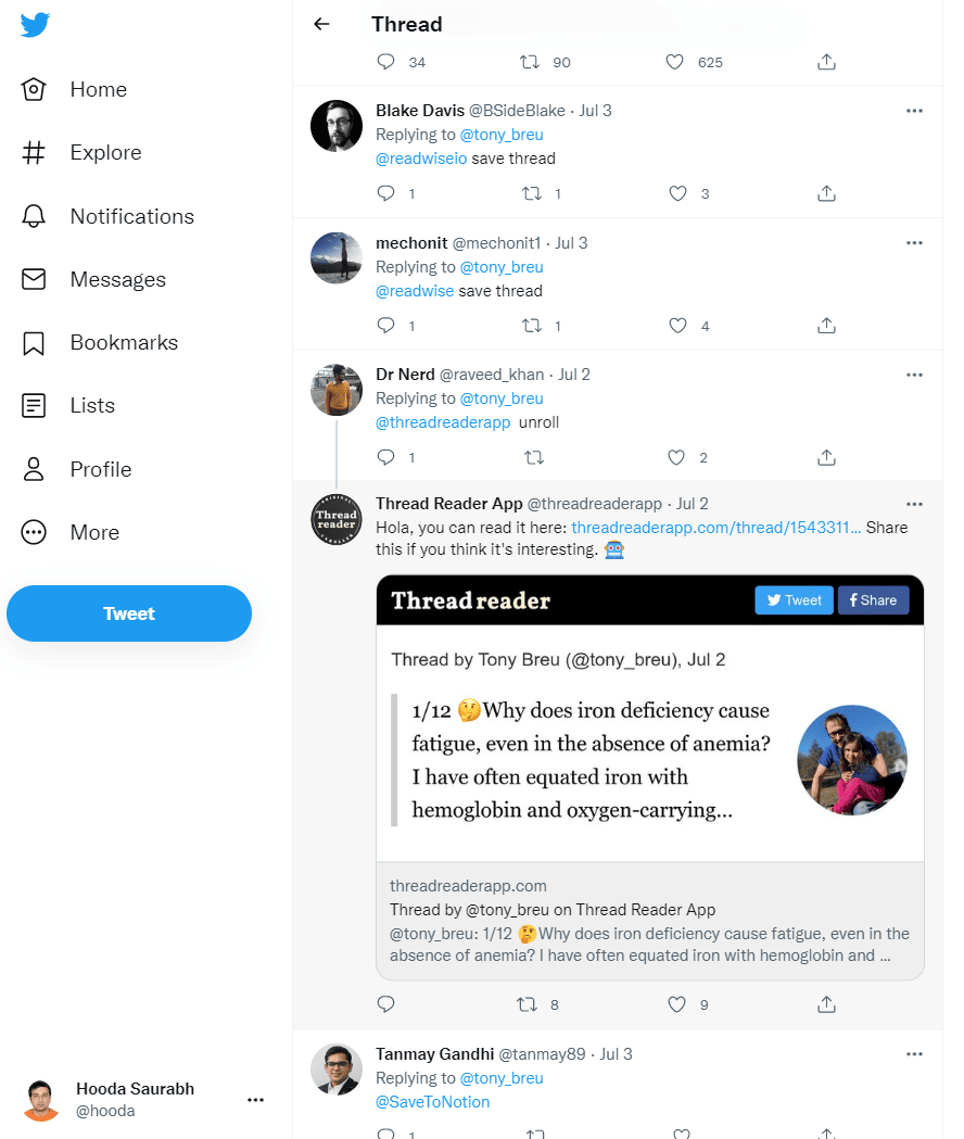
Too many tweet-thread saving apps have cluttered the replies section. When a reader finds a few of them at the top of replies, the user (am using ‘reader’ and ‘user’ interchangeably) doesn’t feel like going past them and reading more relevant replies (hence decreasing user engagement). These junk replies are creating a long-term habit for users not to look at the replies.

- Potential solution: Hide these kinds of tweets except for the user who is saving the thread. Or give this category of replies the least priority and move them to the bottom.
-
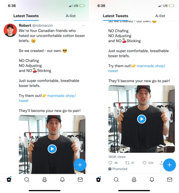
Promoted tweets can be longer than the phone screen hence ‘Promoted’ flag at the bottom of the tweet is not visible. This might confuse the users that who is this person in my feed. It might be good for a few growth-hack-driven marketers but bad for the UX and Twitter platform trust.

-
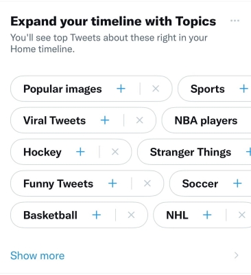
Topics recommendation engine is completely broken on Twitter. I have spent more than 12 years on Twitter but Twitter still suggests topics that are totally irrelevant to me.

-
There is no option to save the Tweet drafts on the Twitter desktop. In other words, you can't access your saved tweet drafts (from the mobile app) on the desktop. Especially inconvenient to users who save a lot of tweets as drafts first and vet them again after a certain duration before posting.