Codecademy is a great website for learning programming. It is helping thousands (maybe millions) of people learn how to code. Content-wise Codecademy rocks however there are few design areas where Codecademy can improve. Before I want to start I want to state categorically that am not a professional designer. I am just a grateful user who wants to give my feedback to a very useful website that is giving so much to users. Here I go: (Note: please click on blog images for bigger, better, and clear images)
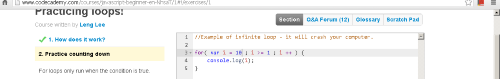
Codecademy header needs to be visible. Always.
The header contains a company’s brand identity (logo) and the most important links. Moving the header outside the visible page (like in the image below) when a user scrolls down is not a good option. Always flaunt who you are.
Other moving and fixed parts:
Editor area and result area should always remain fixed on the web page independent of scroll (unless when a user scrolls to the bottom of the page for the footer). Even now editor and result areas are somewhat fixed but slightly move up and down as the user scrolls up or down. There is no need for them to move. While writing a line of code, a user is generally focused on a particular line in the editor area and simultaneously going through the lesson's instructions. When the user scrolls up/down the lesson instruction pane, the editor area also wavers up/down because of which the user needs to refocus/find her line of code again. Lessons' instructions should move up and down independent of the right-hand side Editor and Result area.
Run, Reset and Save options:
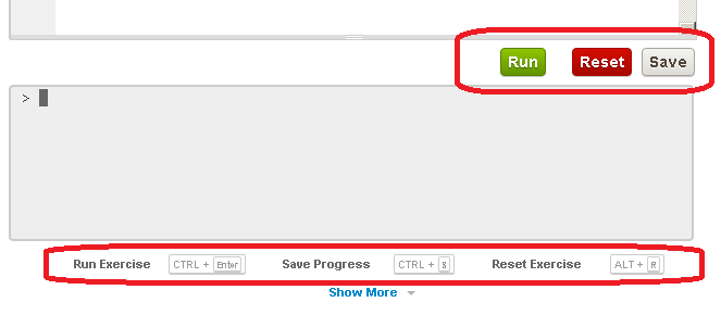 Run, Reset and Save buttons/info is getting duplicated on the screen hence eating a lot of precious webspace. Info from both the highlighted areas (in the image above) can be clubbed in a single horizontal row. Something like:
Green Run button (Ctrl+enter) then Red Reset button (Alt+R) then Grey Save button (Ctrl+S).
This will also free up some space for increasing the height of the result area so that users can see more lines of results in the result area. Exercises, where the result is displayed in various lines, will be better and fully displayed in that case.
Run, Reset and Save buttons/info is getting duplicated on the screen hence eating a lot of precious webspace. Info from both the highlighted areas (in the image above) can be clubbed in a single horizontal row. Something like:
Green Run button (Ctrl+enter) then Red Reset button (Alt+R) then Grey Save button (Ctrl+S).
This will also free up some space for increasing the height of the result area so that users can see more lines of results in the result area. Exercises, where the result is displayed in various lines, will be better and fully displayed in that case.
Movement from one section to other:
When one section is finished in a course then the link to the next section is shown in the result area. If we click on that link then the next section instruction set appears but it is never completely visible on the web page. Some part of the lesson is always hidden at the top. A user has to scroll up the instruction panel to see the start of a new section’s instruction set.
Wrapping text in Editor as well as Result area:
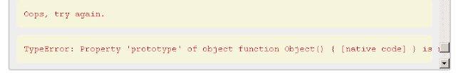 If some error message is longer than the width of the result area then the result area doesn't auto-wrap the message. It just goes beyond the console area and is not visible.
Codecademy breadcrumbs (trackName >> courseName >> sectionName) alignment:
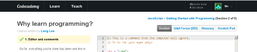 Course hierarchy seems to be displayed in a disorderly fashion on the web page. Track>>Course (for example JavaScript>>Getting Started with Programming?) is on the right-hand side while the section name (“Why learn programming” in this case) is on the left-hand side. If all three of them can come neatly on the left-hand side (maybe like: JavaScript>>Getting Started with Programming>>Why learn programming?) then the hierarchy will be more clear and some precious web space can be spared for the Editor/Result area.
PS: This post was originally posted on hoodasaurabh.blogspot.com